My main responsibility at Crosscheck Networks was to fix whatever bugs in our code that were assigned to me. A few of the more difficult bugs required me to ask my teammates for help. Sometimes this would involve physically moving my feet and walking over to another developer's office or cubicle, and having a face-to-face conversation about what steps I should try next in order to solve a particular bug. Other times, the only team member who had any sort of familiarity with the bug I was assigned worked remotely. Therefore, virtual means of communication were necessary, such as shooting emails back and forth with each other. While emailing for help was better than nothing, I felt they were an inferior method of communication compared to face-to-face conversations. Emailing tended to be a slower method of getting help, and it was more difficult to get clarification concerning confusing nuances in the code. My supervisor favored using the instant messaging chat function included in Gmail when he had questions that could only be answered by a remote teammate, as well as other teammates. Unfortunately, I did not use that particular feature at any point during my co-op, and so cannot really offer any thoughts about it.
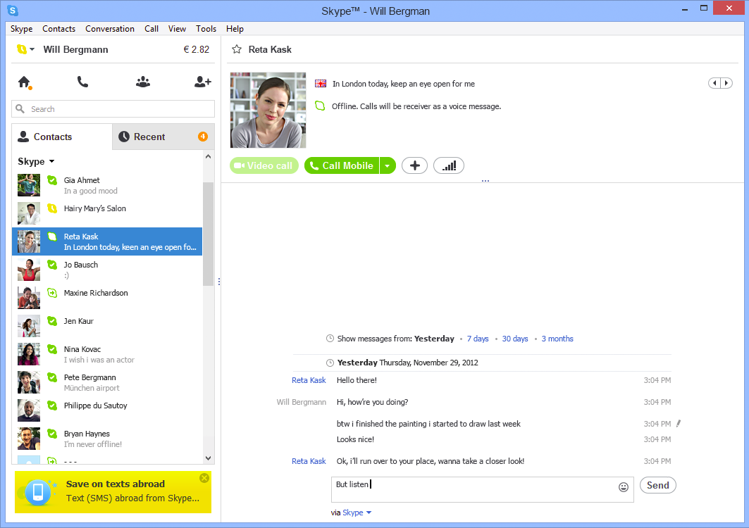
We held weekly engineering meetings to discuss the timeline for our product's next quarterly release, status updates on everyone's assigned tickets from the past week, which tickets each person should be working on over the course of the following week, and other miscellaneous goals that had to be met before that next release. Our out-of-state team members obviously couldn't fly to Newton every week to attend these meetings, and so we needed to find a way to still let them be a part of the discussions. My company's method of choice to allow remote team members to participate was the popular VoIP client, Skype.

Skype was a "good enough" solution to this problem. Our remote team members needed to be able to take part in these weekly meetings, and Skype offered technology that enabled them to fill that need. Through the power of Skype, they were able to connect to our meetings and listen to whatever we were talking about. However, while Skype did in fact adequately address the main problem we had, it lacked in other areas. Our meetings were often delayed due to technical difficulties in setting up a Skype session for the other members to connect to. The audio quality was inconsistent; there would randomly be times when it was near-impossible to understand what the people connecting into the office were saying, and vice-versa. Skype was useless for remote team members whenever a visual presentation was part of a particular meeting. The quality of the webcams we had were not good enough to accurately make out the visuals. Our getaround for this hiccup was to email a copy of the presentation beforehand to our team members who were Skyping into the meeting. This way, they could go through the presentation themselves and follow along with whoever was in charge of that particular presentation. Finally, there was always a slight delay between what had been said and what was heard.

There is definitely no comparison between Skype and actual face-to-face conversations; face-to-face conversations are hands-down superior to Skype (although I definitely prefer Skype conversations to phone conversations - the added visual component with Skype is a huge boon). As mentioned above, the delay in saying something and having that something heard by the opposite person really ruins the flow of conversation, especially if you and your conversation partner also have to deal with poor sound quality on both ends. Trying to make eye contact can also feel a bit awkward since looking into either the webcam or the computer screen doesn't necessarily mean you will actually be looking into the other person's eyes. Using Skype requires us to get over the disconnect in what we would expect versus what the actual reality is, at least when it comes to trying to make eye contact. Another thing that Skype is missing compared to face-to-face conversations is the possibility to have physical contact with the person you are talking to, an important aspect for any conversation. Skype also has the same downfall as email -- it is much more difficult to receive help through these virtual means (but to be fair to Skype, its screen-share feature does make doing so much easier).

Despite my criticisms of Skype, I actually do think it's a well-designed program. The default color scheme is light, bright, and easy on the eyes. It makes me feel cheerier with thoughts of springtime whenever I use Skype. Advertisements, that necessary evil, aren't exactly hidden away, but they are not super obtrusive either. There are distinct borders between each section of the screen, clearly outlining and separating the different parts such as your contacts list, your chat history with a specific contact, or shortcuts to accept a contact request or add a new contact. The icons for each shortcut make it obvious to the user what each button's function is without being too busy or too vague, and they fit into the theme of the interface perfectly. I also really like the ability to filter the chat history by time period; it makes searching for old messages much simpler. I can honestly say I don't think the user interface falls short in any way.
If I were to design my own virtual collaborative workspace with full telepresence, it would combine the features of Skype and Smart Board. It would use a large, high-definition widescreen monitor equipped with the best webcam money could buy on both ends for the best possible viewing experience. The large monitor and the webcam would solve the problem of not being able to clearly make out visual presentations, since they would be blown-up and in crystal-clear quality. However, it would probably be a little weird for everyone else in the office to have a few people's faces blown-up to such huge sizes, staring at them from the monitor. My theoretical workspace would keep Skype's video conferencing, instant messaging, and screen sharing features. The combination of those three features already makes for a rather decent virtual workspace. You have the video conferencing to show off things visually and to carry on a pseudo-face-to-face conversation (not the best, but it'll do), the instant messaging to send files and website links quickly to one another, and the screen sharing to make reviewing each other's code much easier. In addition to all of these features, I would add the technology from Smart Board to enable user's to 'draw' on their screens. Being able to draw on a screen to highlight certain areas, or just to have a quick and easy place to think on a board, is one of the most useful innovations of the 21st century. I truly believe such a workspace would make coding collaborations and meetings more useful. Best of all, it can easily be built with existing technology. The last tweak I would make is to require high-speed Internet cables between the two users, to minimize auditory and visual lag as much as possible, and to maintain consistently clear sound quality.